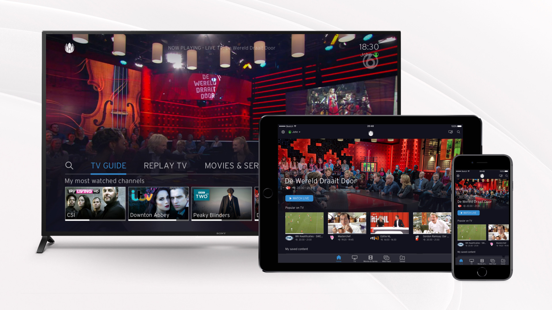
Liberty Global is the world’s largest international TV and broadband company. I worked on their TV platform Horizon 4, which service is provided across 12 countries with a total of 21 million users, including brands like Ziggo, UPC and Virgin Media. While I was working there, the product was launched in Germany, Switzerland, The Netherlands, Belgium and Chile with a much improved NPS score compare to the old version Horizon 3. I was very glad that I could be part of this journey.
Shaping Intuitive TV Interfaces
Time
March 2018 – Aug 2019
Services
Wireframe
Prototyping
Product testing
UI
My role
I worked on many area of the product, from high level feature design to UI changes across the platform, from product testing and researches to maintenance of visual components. My main responsibility includes:
- Interaction design: create user flow and wireframes.
- Visual design and delivery to developers.
- Create prototypes to review and test ideas.
- Update and maintain visual design components of the library, clear speccing and documentation.
- Review works from developers.
- Present and communicate design to all stakeholders.
Challenges
The main challenge we had was to make a design that fulfills 12 different country’s requirements, law, business contract, different languages, etc. The design needs to be restrained in order to fit all kinds of requirements and the current structure.
Another challenge was that at the time I joined the team, there was no time and budget to do any testing. We spent a lot of time debating design decisions because they are all opinion based. We initiated the process by starting to do it quick and dirty: simply going to the canteen or other departments like HR or finance, who has no idea what we are doing. Gradually we managed to set-up a proper room that we can observe and record, and a participants pool with internal employees form different department. By the time I’m about the leave, the higher management seems to get the value of testing and could probably allocate budget for it.
Work example 1: Profile creation flow optimization
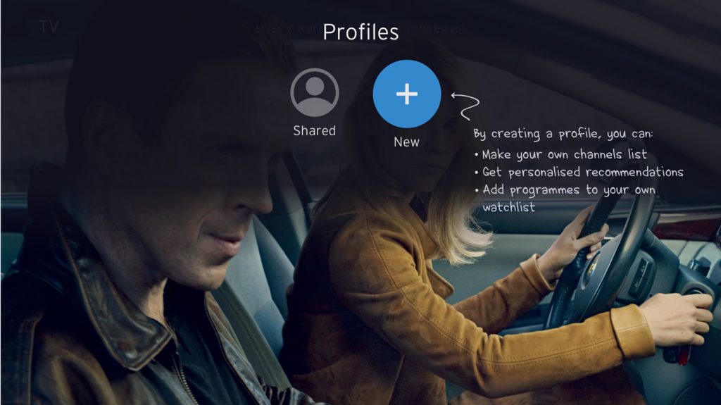
This is an example of what I do at work. On the TV platform, users are allowed to create their own profile, so they can create their own channel line-up, receive more accurate recommendations, have their own watch list and bookmarks, etc. Through a workshop we found out the profile creation flow is not very clear and intuitive. So an optimization is needed.
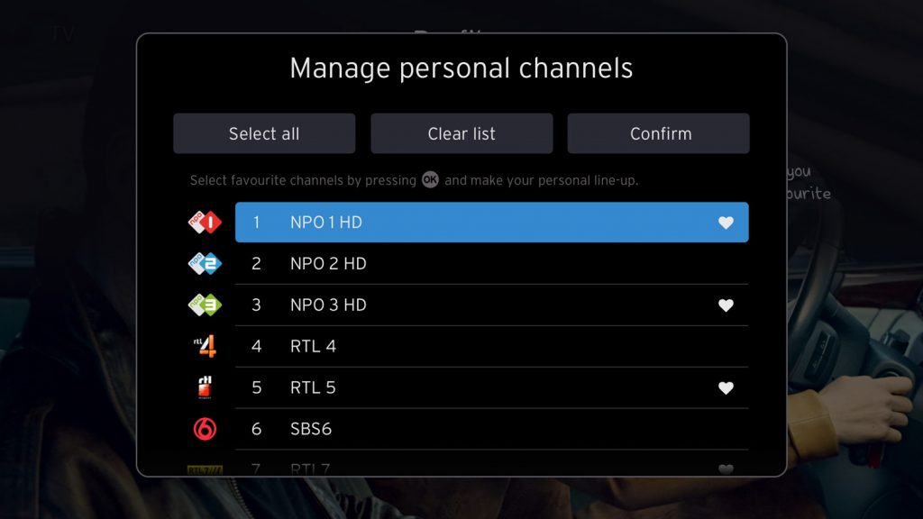
There are 3 steps to create a profile. First, users choose a colour and type a name; second, they can pick the channels they watch the most and rearrange the order; third, they can pick favourite genres to get better show recommendations.
I first evaluated the current flow and marked out the pain points. Below is a shortened version of the flow.

Fig: Evaluation of the current built profile creation flow from the set top box.
First iteration
The biggest change of this iteration was that the value picker of channels was taken out. Users can operate in the same modal instead of jumping to another one. It has instant feedback.
Next to that, I also
1) re-wrote the copy together with our copy writer to make the benefit and instruction more clear.
2) added a function to the flow that after each step, the system can remember what the users had done earlier. So they don’t need to repeat the whole process again when coming back.
3) added a recap message after the user finish the entire process.
While presenting this to the PO, I got a new requirement of adding a function, which is a filter for the channels. Also we got a complaint from Chile. When users add all channels as their favourite, the channel numbers suddenly change. The reason is that channel numbers are not continuous. It could be from 1,2,3,4 and suddenly jump to 10. So after adding all channels as favourite, their channel no. 400 suddenly became channel no. 91. People are confused about it.
New concept and user testing
So I need to work on the new requirement and solve the complaint. After trying a few ideas, I thought maybe it’s better to re-look at this from a new angle. I considered a duo screen option.
The benefit of this is that it make space for the channel filter, users get stronger feedback, reduces the number of clicks on the remote, and hopefully make the process more clear.
Since this is an entirely different approach compared to the existing flow, we wanted to test and see if this approach is truely better. We were especially interested to know whether the users understand the filter function and use the ‘Add all’ button.
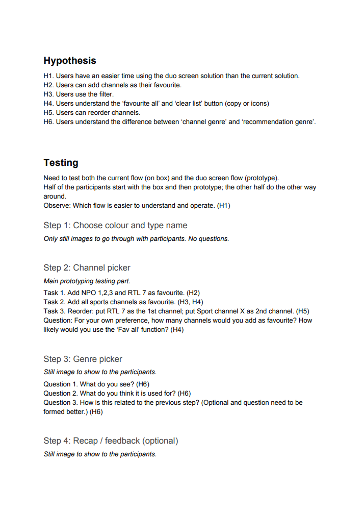
We built a Framer prototype to present the new design solution. During the testing, we ask the users to use both the prototype and the existing built on TV. The detailed testing set up can be seen in the picture on the right side.
The main outcome were very positive, it showed that the users do prefer the new design over the existing one, mainly because:
- The layout is more overviewable
- The adding of channels is easier
- Channel filter helped them go through the huge list way faster
- Clear confirmation
To our surprise, many users immediately went for the filter and start using it without any doubt. They considered it as a major improvement compared to the existing one. It really removed the pain of going through the entire channel list.
One minus point we found here was the channel deletion. Previously on the selected channels, when a user focus on a channel, a bin icon would show up on the right side. Users need to press ‘right’ button and then the ‘ok’ button to remove a channel. With the new design of one click adding a channel, we thought we would apply the same method for the removal. However, it turned out that users could not relate pressing ‘ok’ button to removal. The ‘ok’ action represent something positive, like select or confirm.

Fig: New profile creation flow for testing.
Work example 2: Design a messaging inbox
This is another example. Currently there are push notifications from the editor to the users. These notifications show up at system boot-up, recommendations at video on demand area, or by toast messages. However, they can be easily missed by the users. So a messaging inbox is added for all notifications and users can look for them at any convenient time. This needs to be a function across platform available on TV, website, tablet and phones. I worked together with a designer mainly responsible for mobile devices.
I do think it make sense to have a place for the providers to communicate to its users. But I think in general people don’t want to be bothered again next to all kinds of messages they receive each day, They just want to relax and watch some shows peacefully. So we tried to design this as less un-intrusive as possible. Here we use TV and phone as examples.
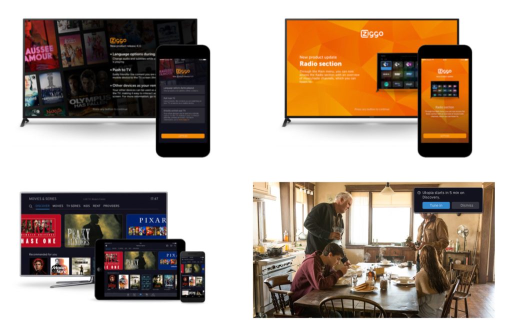
Fig: Existing push notifications
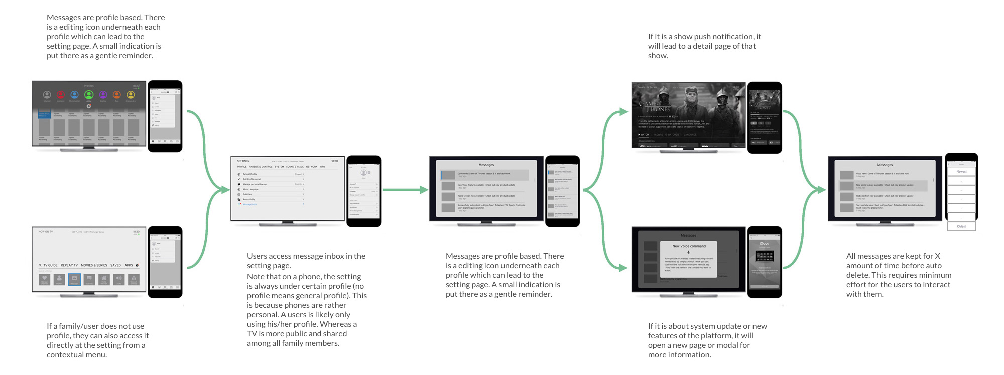
Fig: Message inbox design wireframes
Horizon 4 is a product that keeps evolving. My role also kept on evolving as I worked on a lot of different area of the product. Above are just 2 examples of the work I did at Liberty Global.
Other works were not limited to user flow create and update, component and design library maintenance, visual design and delivery to developers.
Since the launch of Horizon 4 in the Netherlands (Ziggo), the NPS score has raised from minus to somewhere around plus 70. This was a great achievement. I was really glad to be part of it ?
