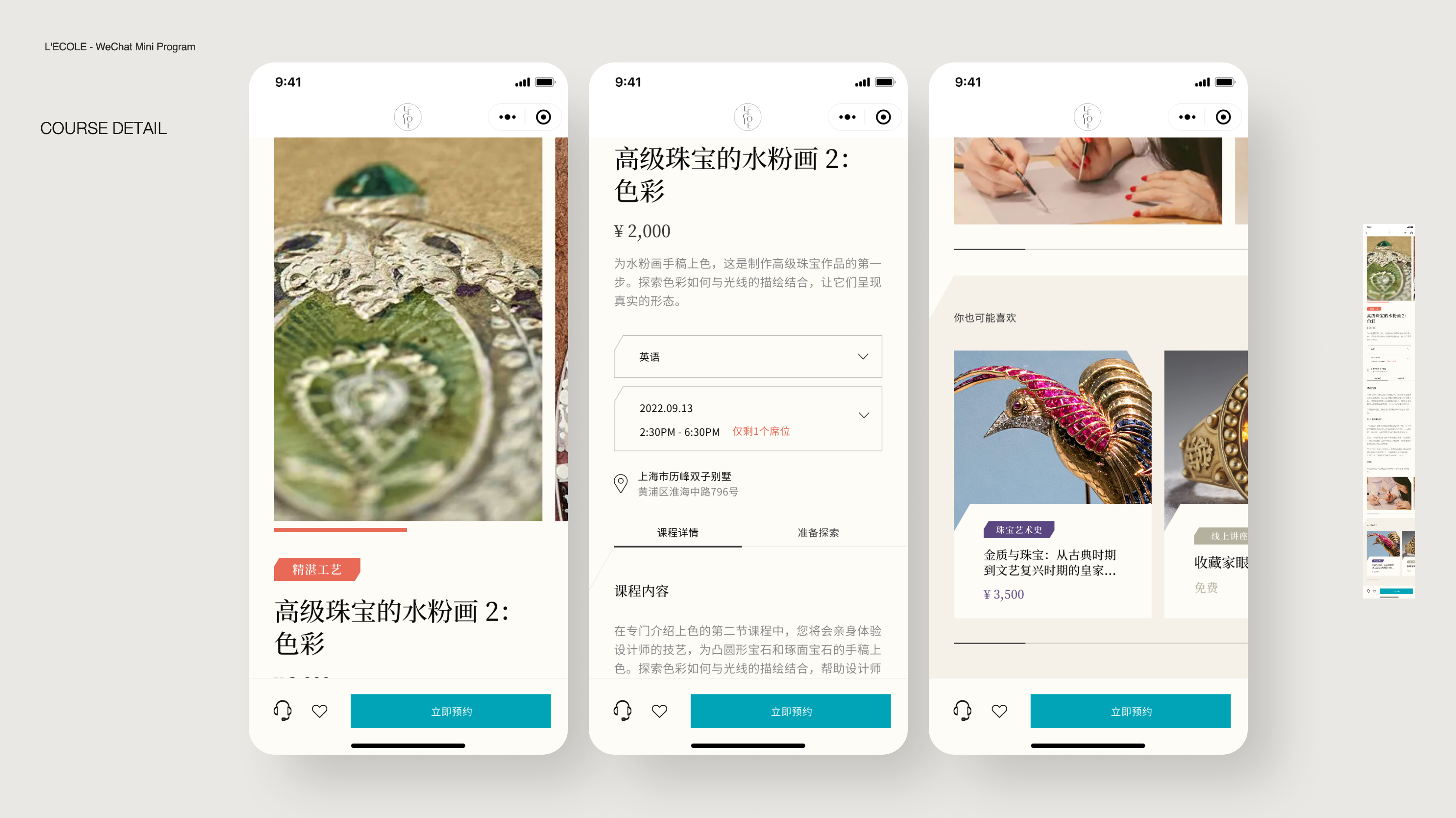
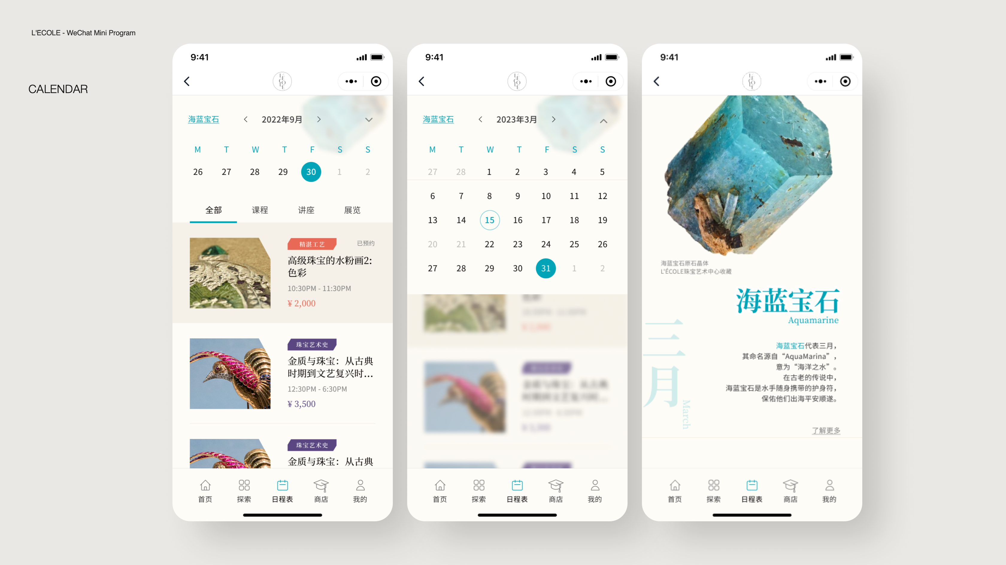
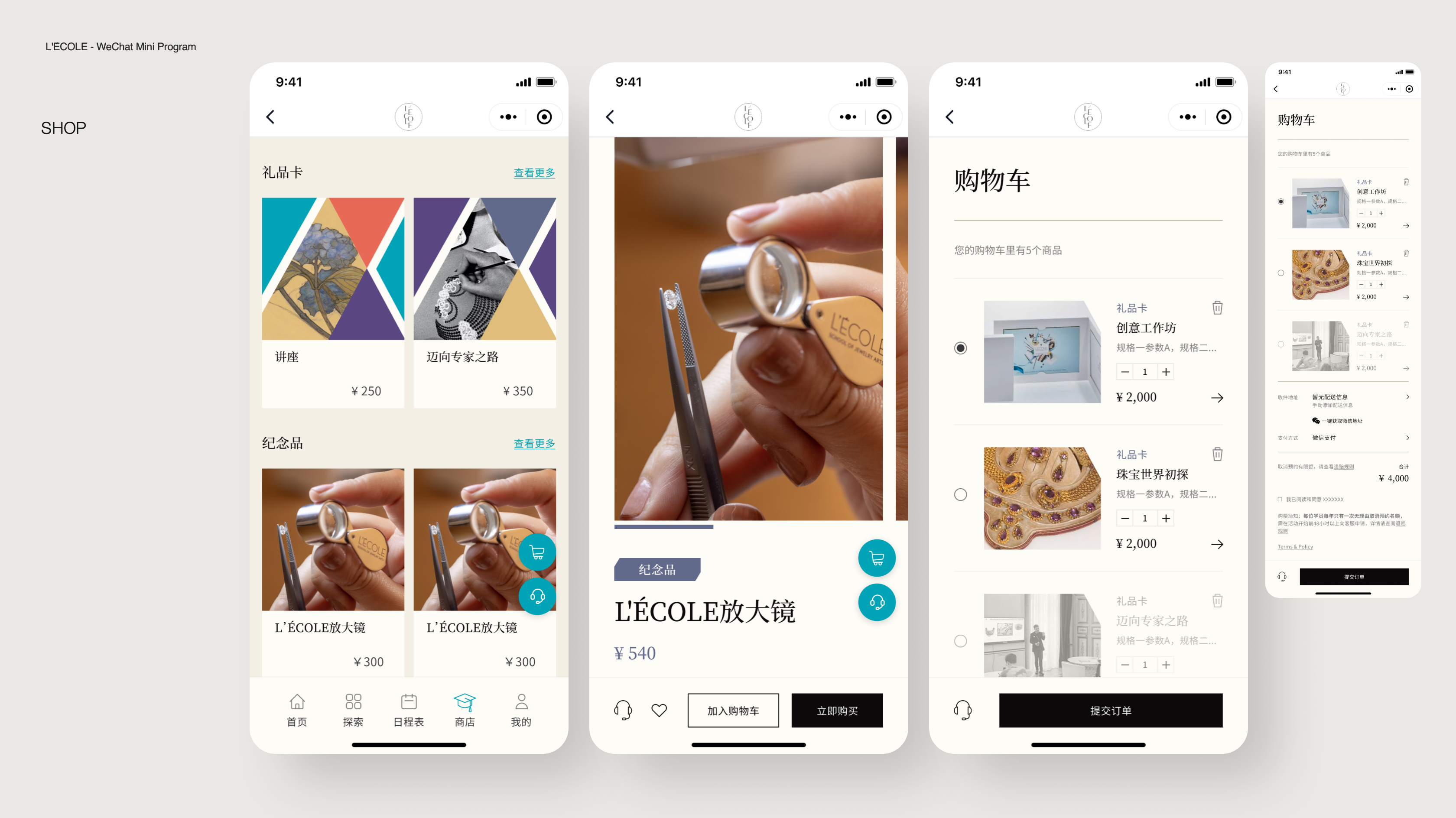
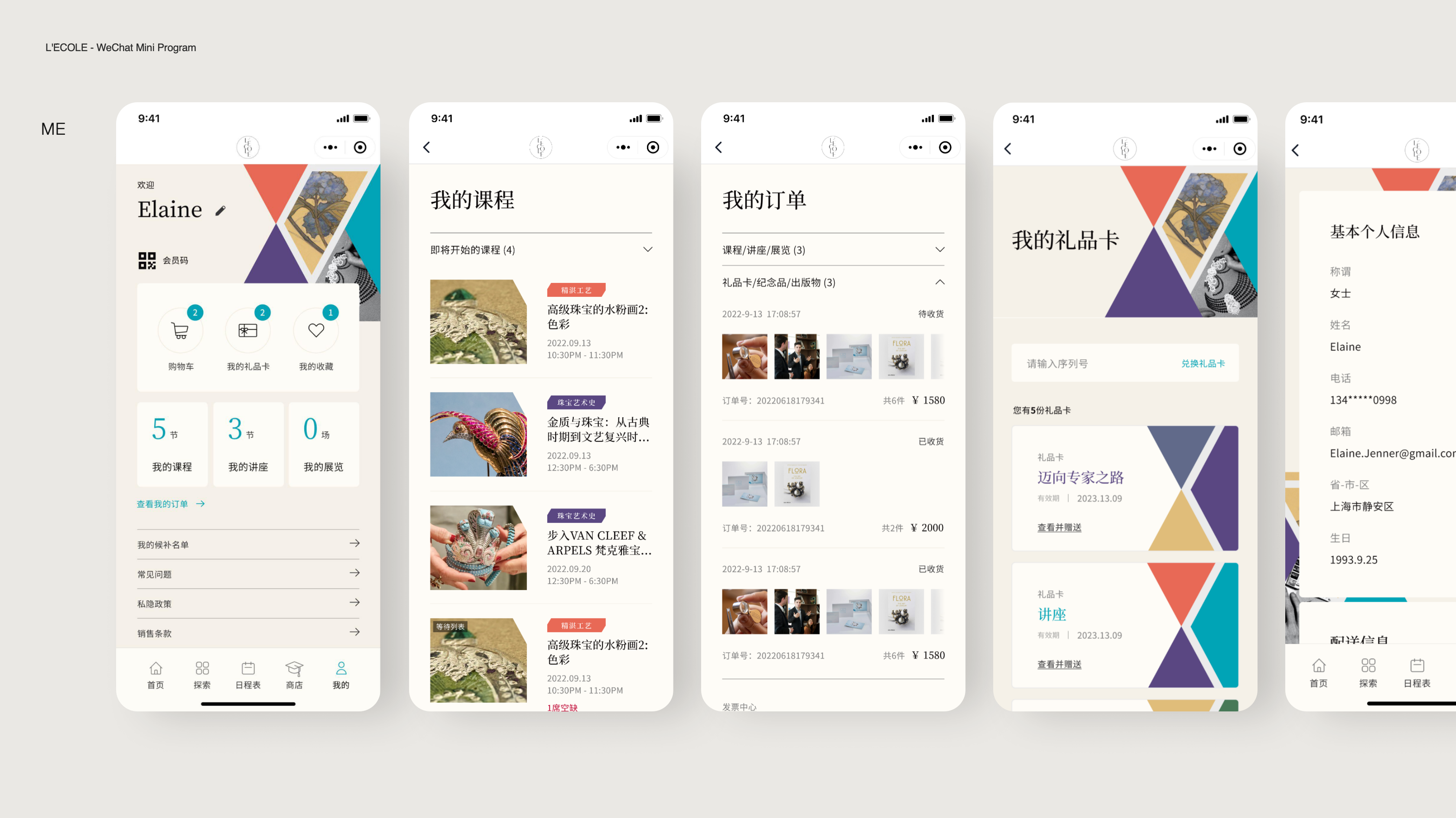
L’École, a jewelry art school supported by Van Cleef & Arples, is expanding its reach by opening a new campus in Shanghai. As part of this initiative, I had the privilege of leading the creation of a WeChat Mini Program that showcases all the school’s offerings—from course and events bookings to product purchases and payments. This project was more than just a digital tool; it became the brand’s new face in China, where the school had been previously introduced solely through a WeChat official account.

The L’École WeChat Mini Program Journey
Time
Aug 2022 – Feb 2023
Services
Team leadership
Design strategy
Wireframe
UI
Design system
My role
This project wasn’t a simple handoff. From pitch to launch, I was deeply involved in every step: research, strategy, conceptualization, and design, collaborating across teams for over a year. At the end, we created a seamless, user-centric experience while reinforcing L’École as a brand in a new market.
Understanding the market
Initially, L’École’s global team questioned whether a WeChat Mini Program was necessary. Wouldn’t a traditional website suffice, just as how it worked everywhere else? To answer this, I led a digital channel analysis, diving into how Chinese consumers interact with brands. The findings were clear: WeChat isn’t just a platform in China – it’s the platform.
From a design perspective, we thoroughly audited L’École’s website and examined all the modules. Our goal was to propose a structure and create visuals that aligns with their existing solution while catering to the specific business needs in China.
These initial efforts made sure that we kept brand consistency across markets with minimal cost, which eventually convinced the global team that a WeChat Mini Program is the optimal choice for both business and consumer perspective.

Fig: Digital channel analysis
User journey and flow
With L’École being a fresh face in China, there weren’t existing users to study. Instead, designers gathered insights from conversations with L’École teams in Hong Kong and Paris to define potential user personas and behavior patterns. Using this information, we mapped out detailed user journeys that captured not only the functional aspects of the Mini Program but also the emotional highs and lows users might experience along the way.
For instance, take the process of browsing and booking a course. The journey was broke into clear steps and sub-tasks, analyzing the emotions a user might feel – curiosity, excitement, or even frustration. This allowed us to pinpoint moments where the experience could be improved, ensuring every interaction felt intuitive and rewarding.

Fig: A simple user journey example
We then translate these user journeys into a ‘system flow’. We carefully consider how our Mini Program can fulfill these desires and create the flows that meet user expectations. To achieve this, we utilize user flows to map out the different routes within our Mini Program. Given the diverse range of functionalities, we design multiple user flows that align with both business and user needs. Overall, we have developed 8 different user flows across 4 action categories.
Below is an example of how a user can book a course or purchase a product. This user flow was designed to cater to these specific actions, ensuring a seamless and intuitive experience for the users.

Fig: User flow example
Complex System Statuses
One of the major challenges we faced was dealing with multiple statuses within a single page, depending on the user’s progress in their journey. This complexity was particularly evident when it came to booking courses and purchasing products. We had to consider factors such as pre-booking or pre-purchasing availability, waiting lines, payment status, items received or redeemed, return or cancellation processes and their conditions, refund status, and even the status of canceled items. These considerations resulted in highly intricate page designs and even more complex development logic.
To address this, the design team worked closely with the development team to simplify complex flows without compromising functionality. Regular client communication also helped us present trade-offs and recommendations, ensuring everyone was aligned. Ultimately, this close collaboration resulted in an intuitive and scalable solution.

Fig: Minimizing complex status
Visual design and Design library
The visual design was where creativity truly came into play. We successfully delivered a comprehensive design system that perfectly captured L’École’s luxurious and artistic essence.
However, the exploration stage came with a unique challenge. L’École was keen on using their key visual as the foundation for the home page design, featuring numerous clickable buttons as quick links to other pages.
As experienced designers, we quickly identified the issues: the fragmented design hindered readability, offered limited clickable areas, and posed significant scalability challenges for future updates. Additionally, the implementation required complex coding, driving up development and maintenance costs. Despite multiple iterations, none of our attempts fully resolved these concerns.

Fig: Unsuccessful initial attempts
After several trial and fails, we took an ’dissection’ approach and tried to deconstruct the key visual into geometric shapes. We explored two directions based on this concept.
Direction 1 involved deconstructing the graphic into isosceles triangles, resulting in a static page design.
Direction 2 utilized hexagons, creating a scrollable page design.
Both design directions incorporated the signature 60 degree angle from the key visual, staying true to L’École’s artistic identity. While we were pleased with both concepts, the L’École team shared our enthusiasm. Ultimately, we chose the second direction for its superior scalability and long-term adaptability.

Fig: Art direction 1

Fig: Art direction 2
Once the direction was finalized, we applied the 60 degree angle consistently across the entire design system—from cards to labels—ensuring visual harmony and a cohesive aesthetic throughout the Mini Program.
The design system was crafted with meticulous attention to detail, covering every component: fonts, color palette, buttons, dropdowns, sliders, and more. To ensure seamless implementation, we also delivered comprehensive interaction behavior specifications, leaving no detail unaddressed.


Fig: Selected Design System example
Final results
Launching a new brand in a new region is no small feat, but through continuous collaboration, adaptability, and user-focused design, the L’École WeChat Mini Program went live in August 2023. Let’s look at some of the final results below.
From navigating cultural nuances to managing technical intricacies, this project was a testament to the power of strategy, creativity, and teamwork. For me, it wasn’t just about delivering a product – it was about crafting an experience that connects people to the artistry and elegance of L’École.


